Colour Iteration: Quick Passes to Find a Palette
Keep colour exploration small and decisive
Colour decisions can quickly derail a study if approached as an open-ended problem. The most productive approach is to reduce the problem into a sequence of small, fast experiments. Each pass answers one question: mood, contrast, temperature, or emphasis.
Set constraints first
Limitations speed up decision-making. Try one of these simple constraints before you start:
- Three-colour limit: Pick one dominant, one supporting, and one accent colour.
- Temperature split: Keep warm midtones and cool shadows, or vice versa.
- Value-first: Lock values, and only change hue and saturation during colour passes.
Practical pass sequence
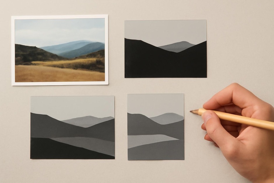
- Value pass: Convert the composition to greyscale and establish clear contrasts. This ensures legibility regardless of colour.
- Dominant colour pass: Add a flat dominant colour on a separate layer, set to multiply or normal depending on your software. This is the anchor of the palette.
- Supporting pass: Test one or two supporting colours to animate midtones and secondary planes.
- Accent pass: Add a bright accent in small doses for focal emphasis.
- Adjustments: Use global hue/saturation or colour balance layers sparingly to nudge relationships without re-painting.
Concrete visual examples
Example 1: Quiet interior. Start with a desaturated, cool dominant to establish a calm mood. Use a warm supporting colour on a lamp or fabric to create a gentle focal pull, and a bright warm accent for a small highlight.
Example 2: Energetic poster. Choose a saturated warm dominant, a high-contrast cool supporting colour, and a neon accent for maximum energy. Keep values clear so the bold colours do not muddy the composition.
Iterative tests and versioning
Create a small grid of 6–9 thumbnail colour explorations at a consistent size. Limit each iteration to a single change: tweak the dominant hue, swap the supporting colour, or change accent placement. Label each thumbnail with a short note about the change and why it matters.
When to stop iterating
Iteration is useful until the palette clearly supports your compositional and emotional goals. If changes no longer yield meaningful differences, choose the best option and move to refinement. Endless tweaking often masks uncertainty about the underlying value or compositional decisions.
Final tips
- Work in small thumbnails to test many options quickly.
- Use adjustment layers for global changes, and keep one painted layer for the character of the piece.
- Keep a personal palette library of combinations that worked so you can reuse and adapt them later.
Colour iteration becomes a reliable part of your workflow when it is deliberate and constrained. Quick passes lead to clearer choices and fewer indecisive afternoons.